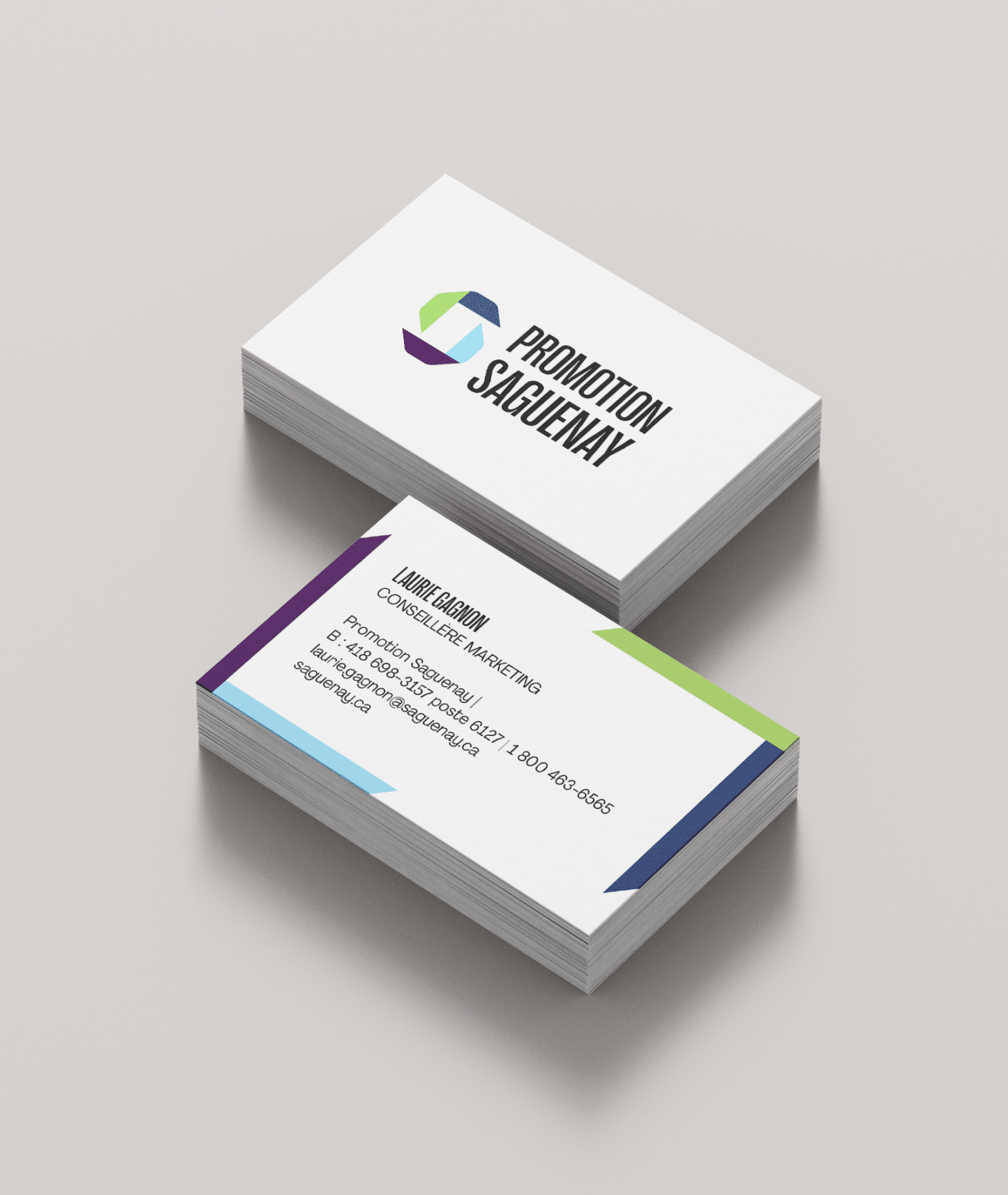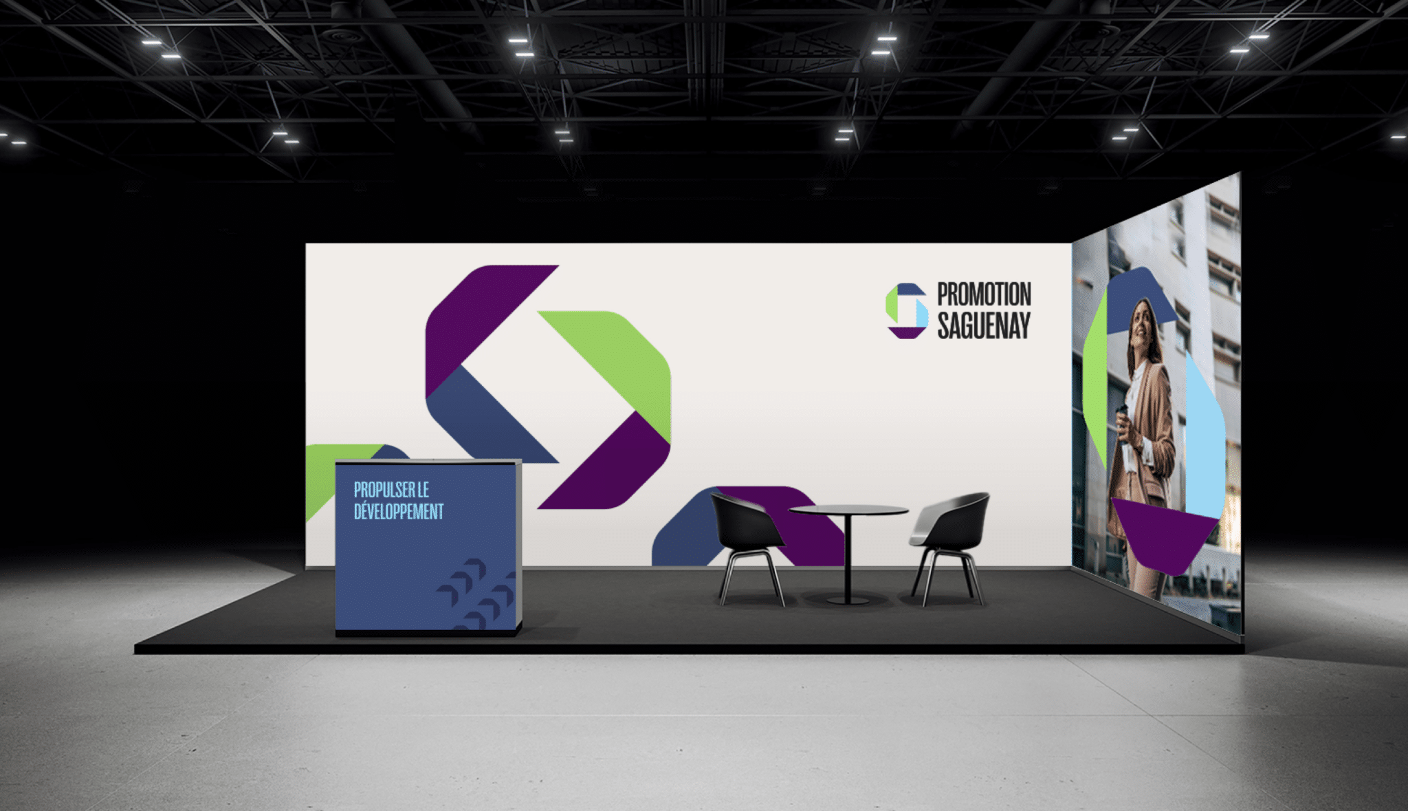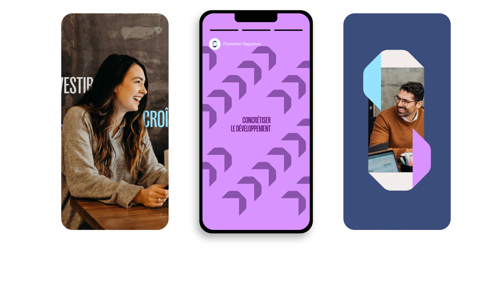
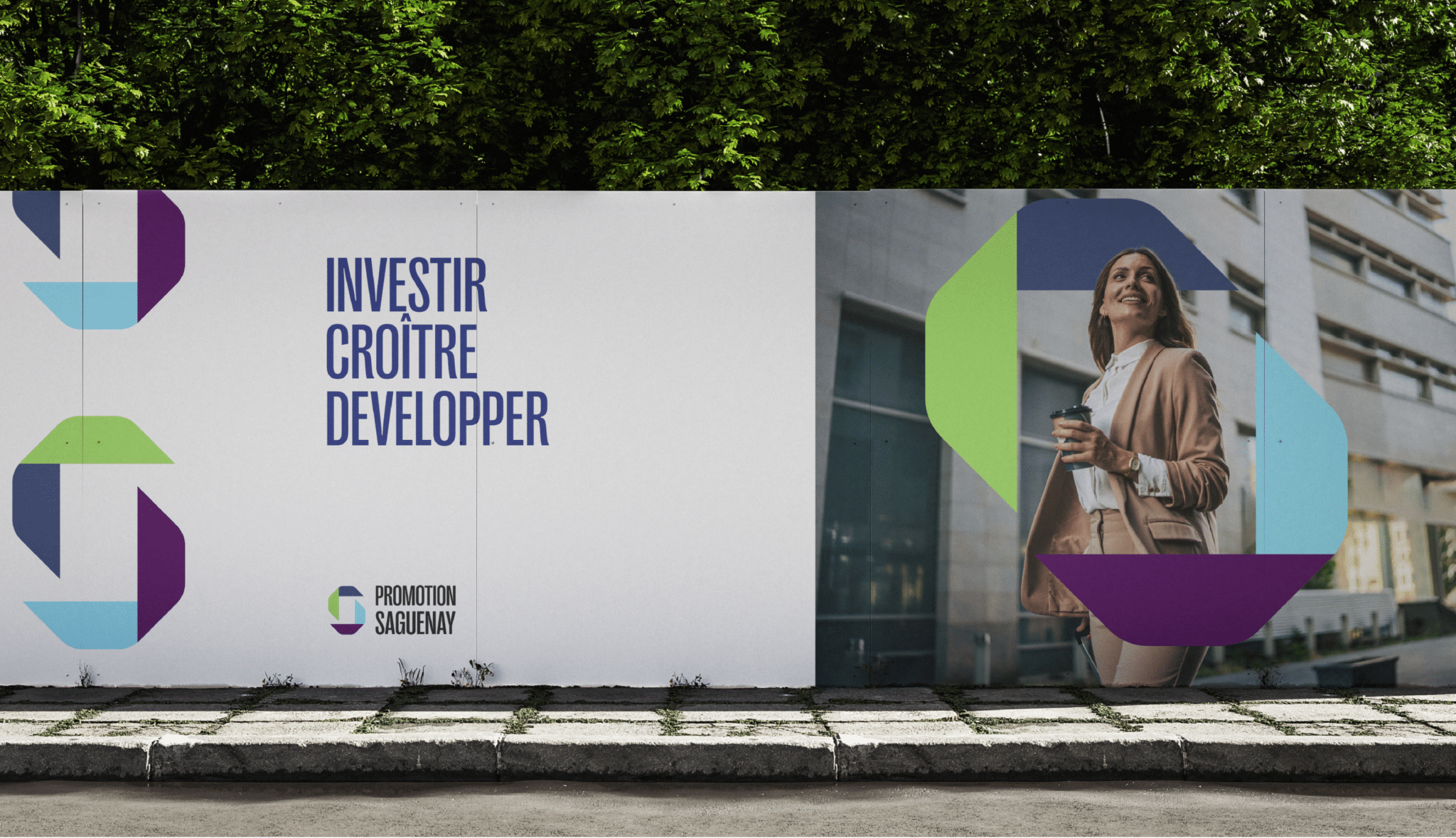
Our mission was to evolve the image to embody progress, dynamism, and the organization’s regional development mission. By leveraging a simple yet evocative graphic system, we built a strong identity that staff can finally wear with pride, marking the beginning of a new era for the organization.
The ultimate creative challenge lay in the duality of Promotion Saguenay’s mission: how to represent economic development, entrepreneurship, tourism, real estate, and the community all at once without cluttering the message?
We focused on movement and synergy by maintaining typography consistency across the entire ecosystem while drawing chromatic inspiration from Saguenay Capitale’s existing brand assets.
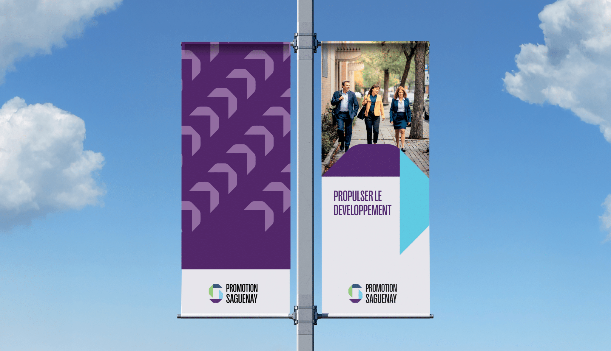

Propel
Growth
The strength of the new logo relies on a multifaceted icon that unfolds through several key meanings:
The “S” in Saguenay
A sailboat to highlight the maritime and shipping sector (ou “boating” selon le contexte)
The concept of progress and forward movement
The gateway to the Saguenay region and the real estate sector
A house representing everyday life and the hub for entrepreneurs
The guidance and support provided by Promotion Saguenay


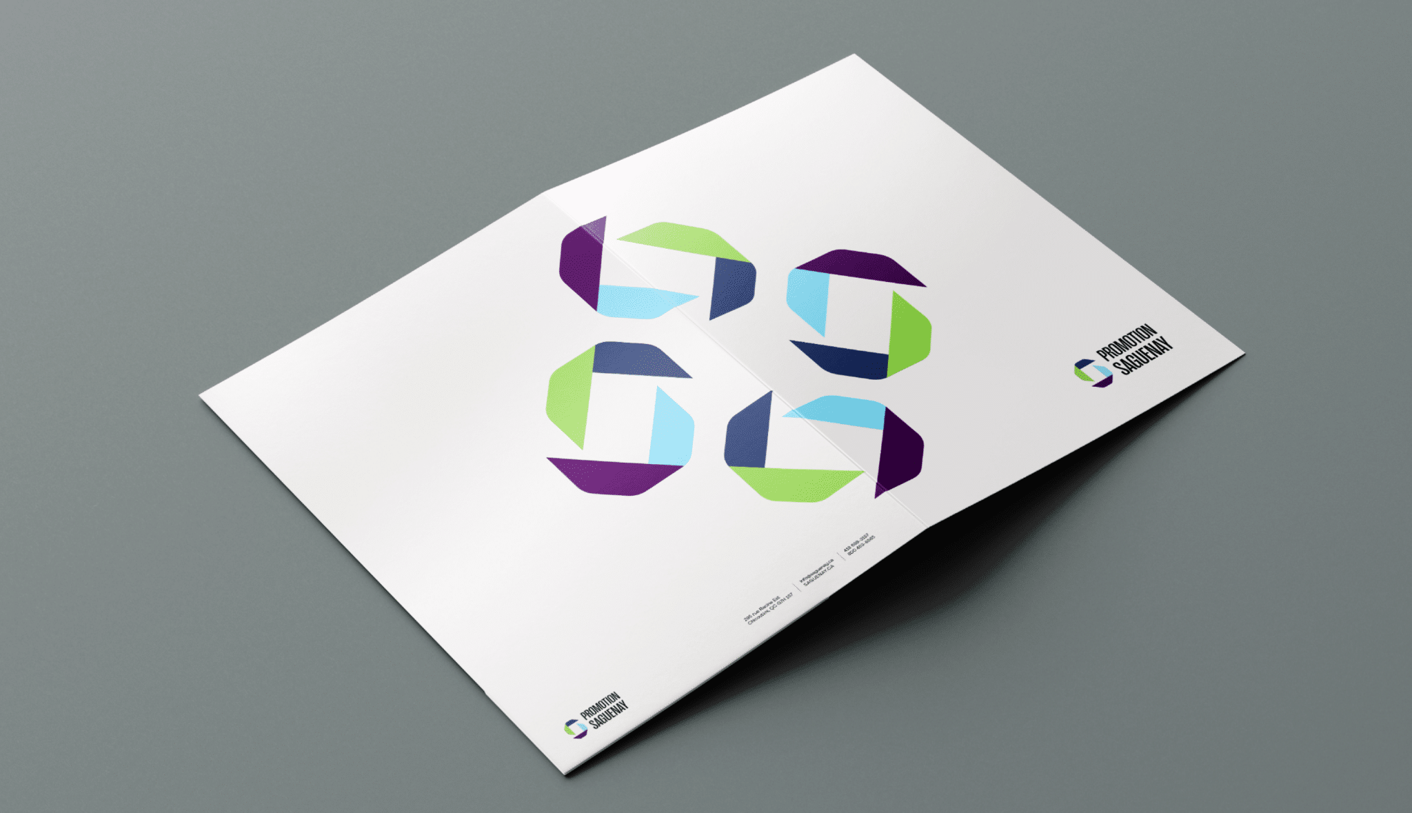
These arrows and dynamic line work are far from static. They form a comprehensive graphic system applied across all touchpoints, unifying communications in a cohesive and energetic way.
This new brand image brought back simplicity where complexity once ruled—without diluting the power of the message. Today, Promotion Saguenay’s team can proudly display an identity that truly matches its ambitions and the momentum it injects into the region.